Why the Same Print Looks Different on Different Fabrics
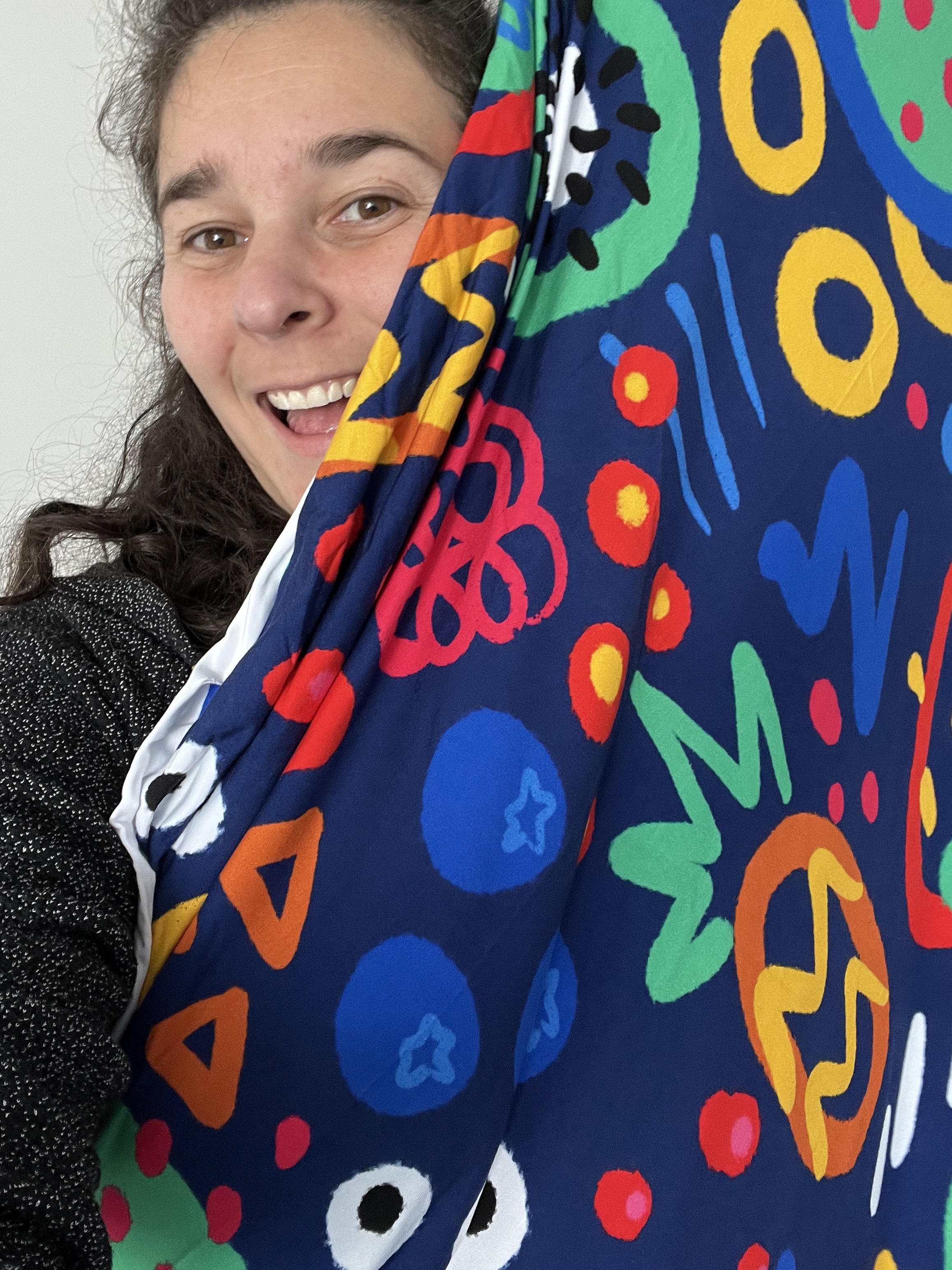
Ever ordered the same print on two different fabric bases and noticed the colours don't quite match side by side? You haven't been sent a misprint — it's chemistry and physics doing exactly what they're supposed to. Here's what's actually going on.
It starts with what the fabric is made of

Most digital fabric printing, ours included, uses reactive dye. Reactive dye works by bonding directly with natural, cellulose-based fibres — think cotton, bamboo, linen, viscose. These fibres soak up reactive dye readily, which is why prints on a pure cotton woven or a bamboo-based knit tend to come out rich, vivid, and close to true to the file you see on screen.
Synthetic fibres (polyester, nylon, the elastane/spandex that gives stretch fabrics their stretch) don't bond with reactive dye the same way. So a fabric base with a higher synthetic content will often print a touch softer or less saturated than a pure cotton woven, even from the exact same design file. Specialty bases like PUL behave differently again, since there's a layer of polyurethane laminate involved rather than a plain textile surface — part of why PUL in particular tends to print noticeably darker than the same file on a woven cotton.
Texture of different fabrics changes what your eye sees

Even on fabrics with near-identical fibre content, texture changes how light bounces off the surface. A smooth, flat knit like a cotton lycra, reflects light evenly, so colours read bright, clean, and close to the file. A textured fabric, like a waffle knit or a rib, has tiny hills and valleys across its surface. Those catch shadow and light differently, which can make the exact same colour read a little more muted or "softer" than it does on a smooth base.
Neither is wrong — it's just two different surfaces doing what surfaces do with light and colour.

Weight plays a part too
A lighter, thinner fabric can let a touch more light pass through it, sometimes reading slightly lighter overall, while a heavier fabric holds the ink closer to the surface and can seem a little richer or deeper.
What this means when you're choosing a base
If getting a print's colours as close to the file as possible really matters for your project, a smooth flat knit or woven is usually your safest bet. Choosing something textured is still a great option, just expect the same print to seem a touch softer or more muted than it would on a smooth base, and factor that into your choice. If you want 2 fabrics to match (i.e. a Cotton Lycra and a matching rib knit) make sure that they're a similar weight (either the 220 or 270 match ok for most prints) and the lighter the print colour, the better the match will be.
As always: your screen is a guide, not a guarantee. Printed colour will vary a little by fabric base no matter what you choose, but it will also look different to one your screen which is normal due to how colours display on different monitors.

Choosing your base
Curious which of our fabric bases would suit your project best? Have a look at our full fabric bases page for composition, GSM and width on every base we stock.
New to preordering with us? Start with How Our Preorders Work for the full rundown.
Or, once you're ready, check out the preorder, or shop our in stock fabrics.


Comments